
A Pythonic data science project: Part I
A complete predictive modeling project in Python
Part I: Preprocessing and exploratory analysis
One of the amazing things with data science is the ability to tackle complex problems involving hidden parallel phenomena interacting with each other, just from the data they produce.
As an example, we will use data extracted from images of forged and genuine banknotes. The distinction between the two categories would be thought to require a deep domain expertise, which limits the ability to check more than a few banknotes at a time. An automated and trustable test would be of interest for many businesses, governments and organizations.
Starting from the data provided by H. Dörsken and Volker Lohweg, from the University of Applied Science of Ostwestfalen-Lippe, Germany on the UCI Machine Learning Repository, we will follow key steps of a data science project to build a performant, yet scalable classifier.
The dataset was built by applying a wavelet transform on images of banknotes to extract 4 features:
-
Variance, skewness, kurtosis of the wavelet transform (respectively second, third and fourth moment of the distribution).
-
Entropy of the image, which can be interpreted as the amount of information or randomness (which is represented by how different adjacent pixels are).
You can find further information on Wavelet on Wikipedia or ask Quora. An explanation of entropy as meant in the image processing context can be found here.
To get a better understanding of the way the algorithms works, the full model will be built from scratch or almost (not using a machine learning library like scikit-learn on Python or caret on R).
Basic statistic notions (variance, linear regression) and some basic python knowledge is recommended to follow through the three articles.
Programming choices and libraries
Language and environment
Python, which is a great compromise between practicality (with handy data format and manipulation) and scalability (much easier to implement for large scale, automated computation than R, Octave or Matlab). More precisely, Python 3.5.1 with the Anaconda distribution 2.4.0, I personally use the Spyder environment but feel free to keep your favorite tools.
Libraries
- Collections (built-in) for occurrence counting
- numpy 1.10.1, providing key data format, mathematical manipulation techniques.
- scipy 0.16.0, imported here for the distance matrix computation and the stat submodule for Quantile-Quantile plots.
- pandas 0.17.1 for advanced data format, high-level manipulation and visualization
- pyplot from matplotlib 1.5.0 for basic visualization
- ggplot 0.6.8, which I think is a much improved way to visualize data
- urllib3 to parse the data directly from the repository (no manual download)
So our first lines of code (once you placed your data in the proper repository) should look like this:
import numpy as np
import pandas as pd
import ggplot
from matplotlib import pyplot as plt
import scipy.stats as stats
import scipy.spatial.distance
from collections import Counter
import urllib3
Source files
The source files will be available on the corresponding Github repository. These include:
- preprocess.py to load the data and libraries
- exploratory.py for preliminary visualization
- feature_eng.py where the data will be transformed to boost the model performance
- model_GLM.py where we define key functions and build our model
- model.py where we will visualize characteristics of the model
Dataset overview and exploratory analysis
Understanding intuitive phenomena in the data and test its underlying structure are the objectives for this first (usually long) phase of a data science project, especially if you were not involved in the data collection process.
Data parsing
Instead of manually downloading the data and placing it in our project repository, we will download using the urllib3 library.
url = "https://archive.ics.uci.edu/ml/machine-learning-databases/00267/data_banknote_authentication.txt"
http = urllib3.PoolManager()
r = http.request('GET',url)
with open("data_banknote_authentication.txt",'wb') as f:
  f.write(r.data)
r.release_conn()
data0 = pd.read_csv("data_banknote_authentication.txt",
  names=["vari","skew","kurtosis","entropy","class"])
Key statistics and overview
Since the data were loaded using pandas, key methods of the DataFrame object can be used to find some key information in the data.
data0.describe()| vari | skew | kurtosis | entropy | class | |
|---|---|---|---|---|---|
| count | 1372.000000 | 1372.000000 | 1372.000000 | 1372.000000 | 1372.000000 |
| mean | 0.433735 | 1.922353 | 1.397627 | -1.191657 | 0.444606 |
| std | 2.842763 | 5.869047 | 4.310030 | 2.101013 | 0.497103 |
| min | -7.042100 | -13.773100 | -5.286100 | -8.548200 | 0.000000 |
| 25% | -1.773000 | -1.708200 | -1.574975 | -2.413450 | 0.000000 |
| 50% | 0.496180 | 2.319650 | 0.616630 | -0.586650 | 0.000000 |
| 75% | 2.821475 | 6.814625 | 3.179250 | 0.394810 | 1.000000 |
| max | 6.824800 | 12.951600 | 17.927400 | 2.449500 | 1.000000 |
Negative values can be noticed in the variance and entropy, whereas it is theoretically impossible, so it can be deduced that some preprocessing operations were already performed.
We are trying to detect forged banknotes thanks to the extracted features. The dataset contains 1372 observations, including 610 forged banknotes, so roughly 45%. The two classes are balanced in the data, which might be relevant for some algorithms. Indeed, a higher proportion of a category in the characteristic of interest (here whether the banknote is genuine or not) yields a higher prior probability for that outcome in Bayesian reasoning.
Kernel Density Estimation for each variable by class
KDE are powerful tools to understand how 1-dimensional data are distributed.
The estimate can also be split by class to find differences in the
distributions. Using ggplot and the pandas groupby method, the
plots can be generated and saved as such:
for v in data0.columns[:4]:
ggplot.ggsave(
  ggplot.ggplot(ggplot.aes(x=v, color='class'),data=data0)+
  ggplot.geom_density()+
  ggplot.geom_point(ggplot.aes(y=0),alpha=0.2)+
  ggplot.labs(title='KDE '+v,x=v,y="KDE"),
  'KDE_'+v+'.png',width=18,height=12)
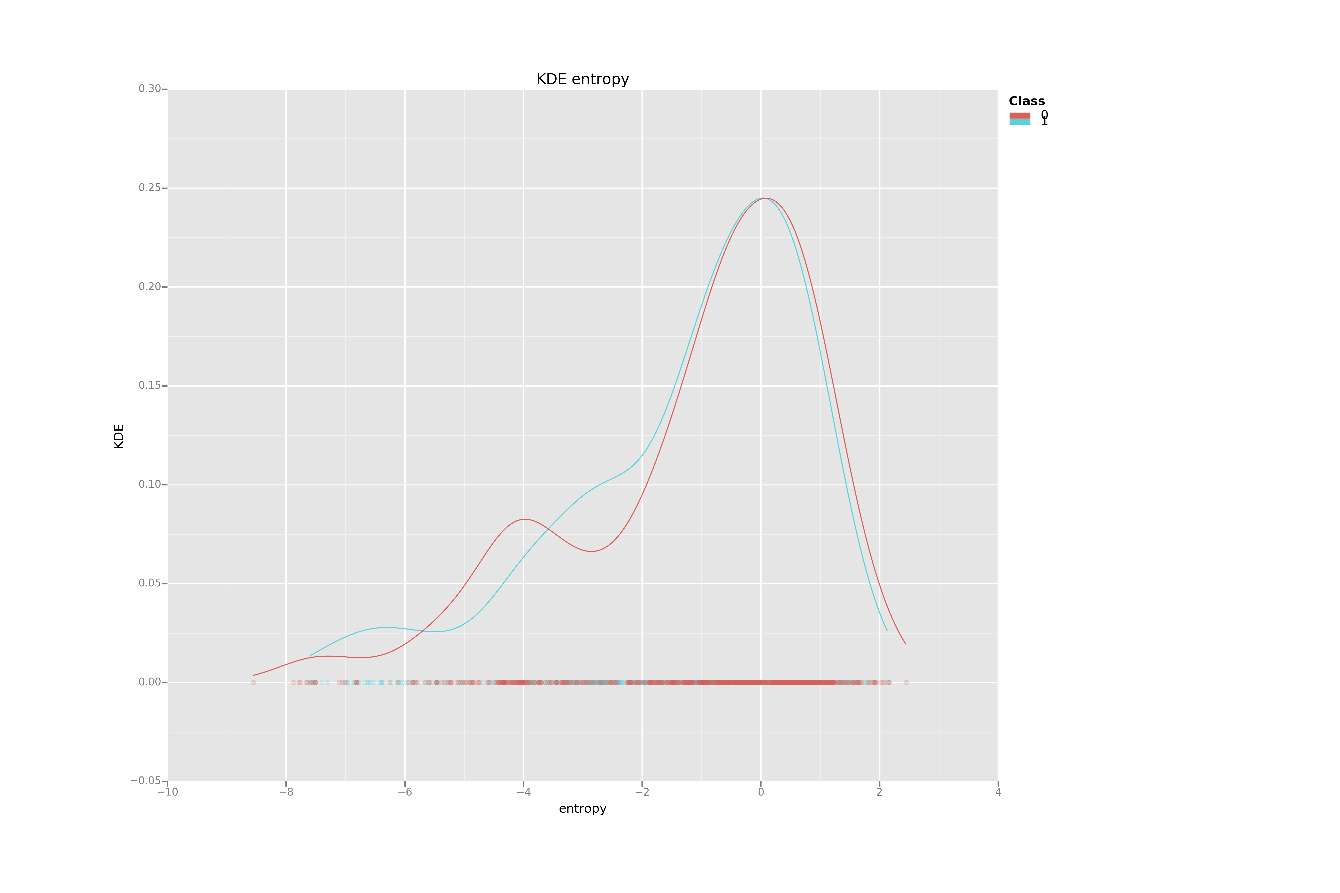
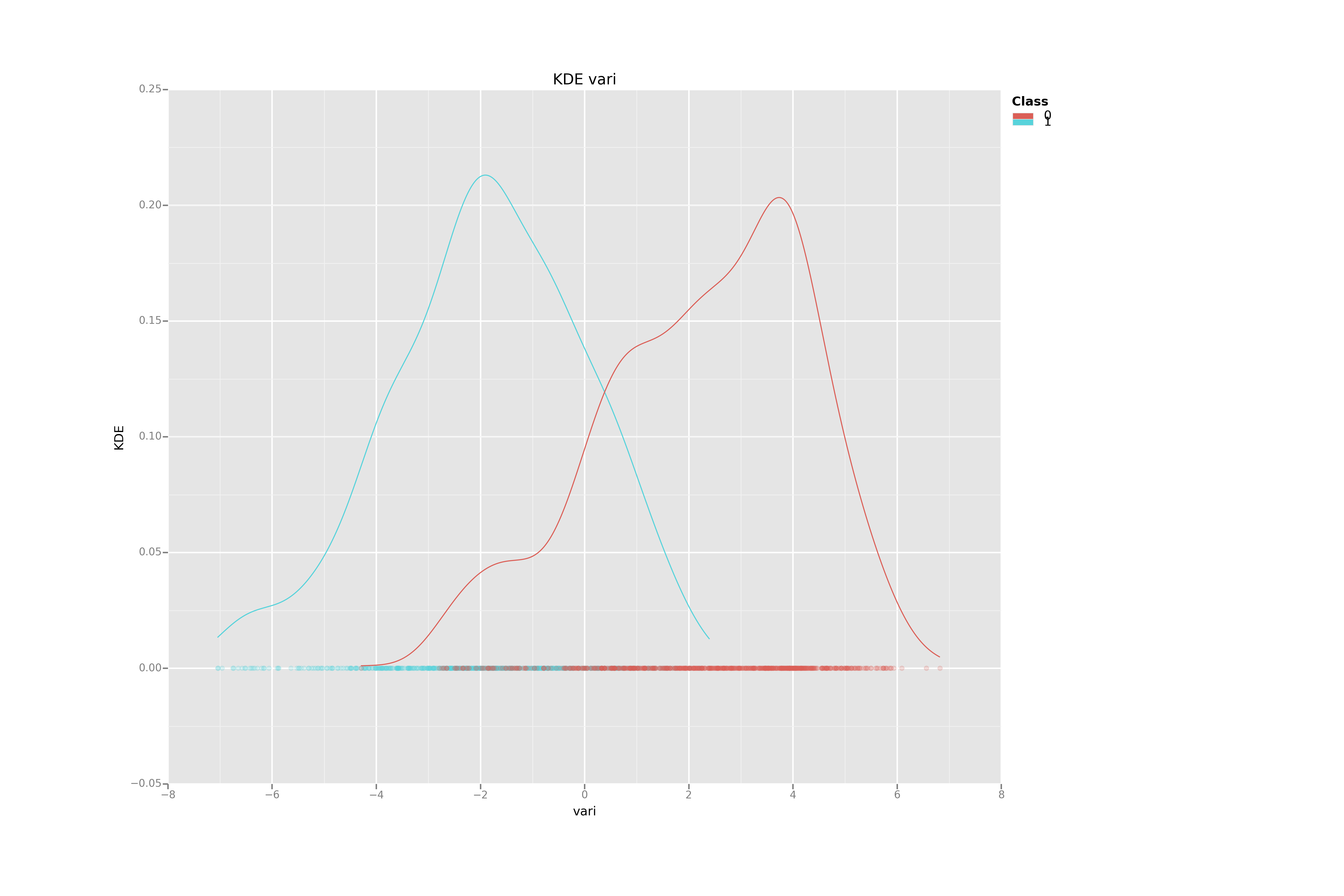
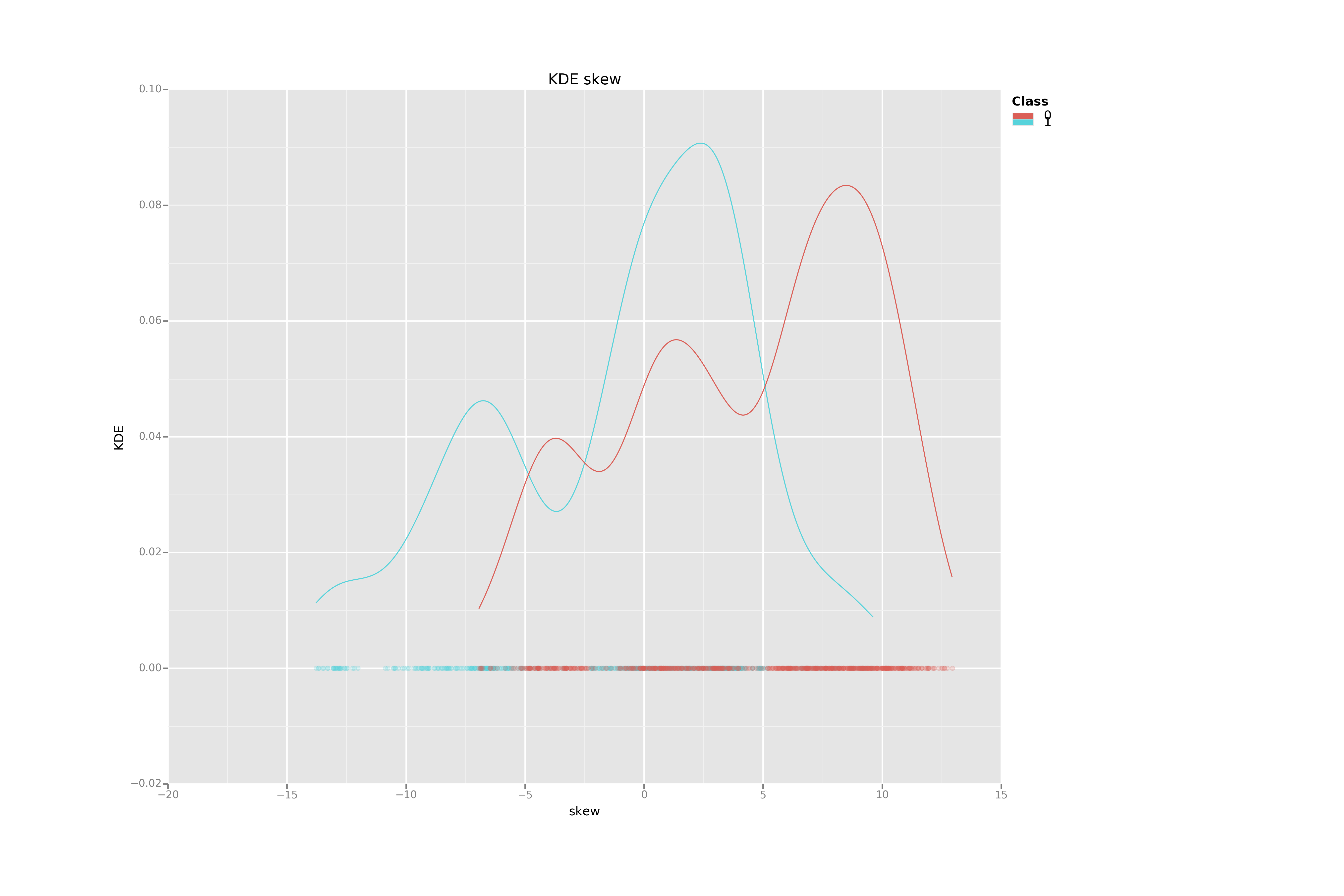
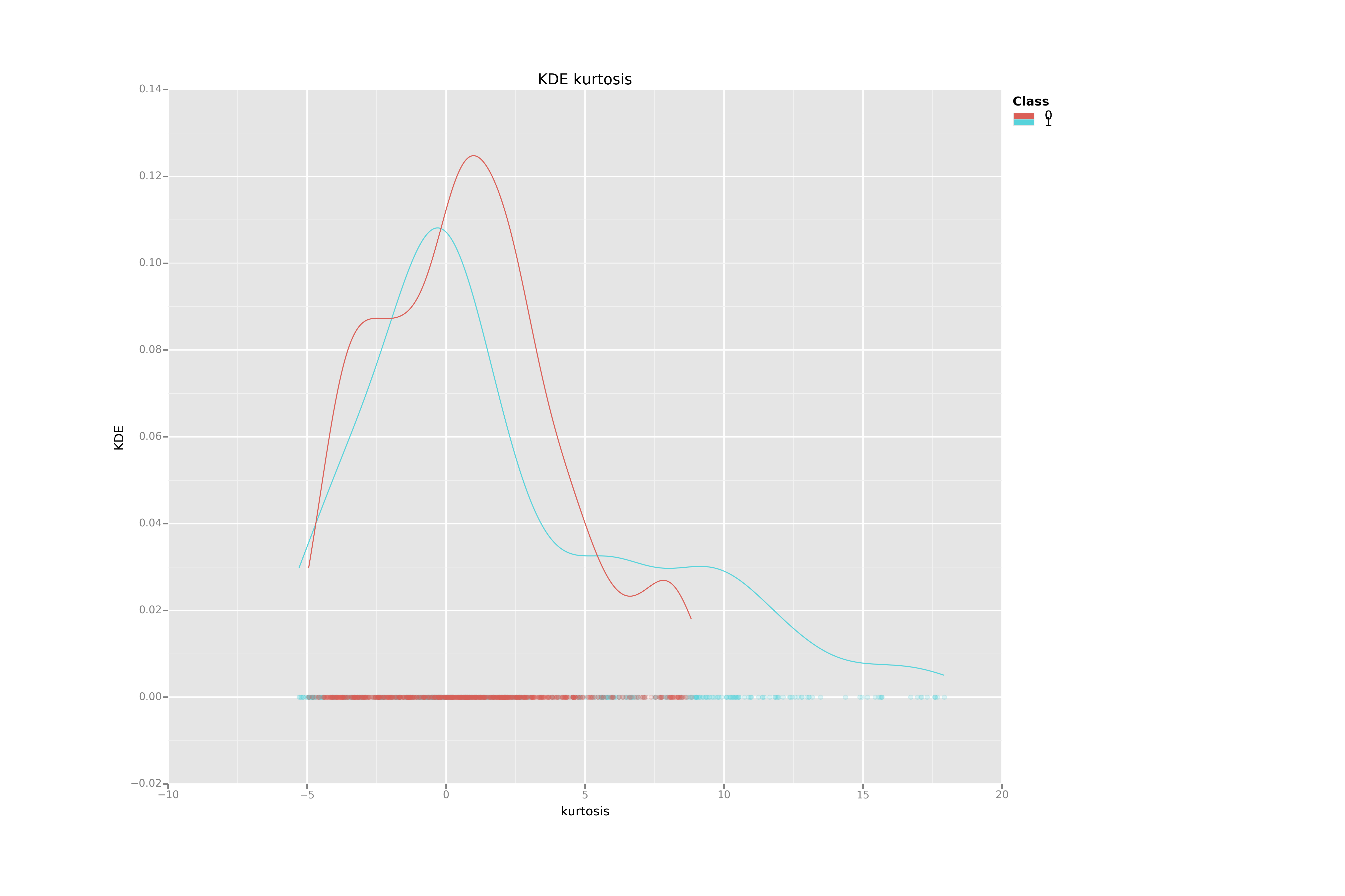
Using this first simple visualization technique, we can deduce that the variance may be much more efficient to separate the two banknotes categories than the Kurtosis.
Visualizing variable combinations with scatter plots
We generate a color list using for-comprehension:
col = list('r' if i==1 else 'b' for i in data0["class"])
pd.tools.plotting.scatter_matrix(data0.ix[:,:4],figsize=(6,3),
color=col,diagonal='kde')
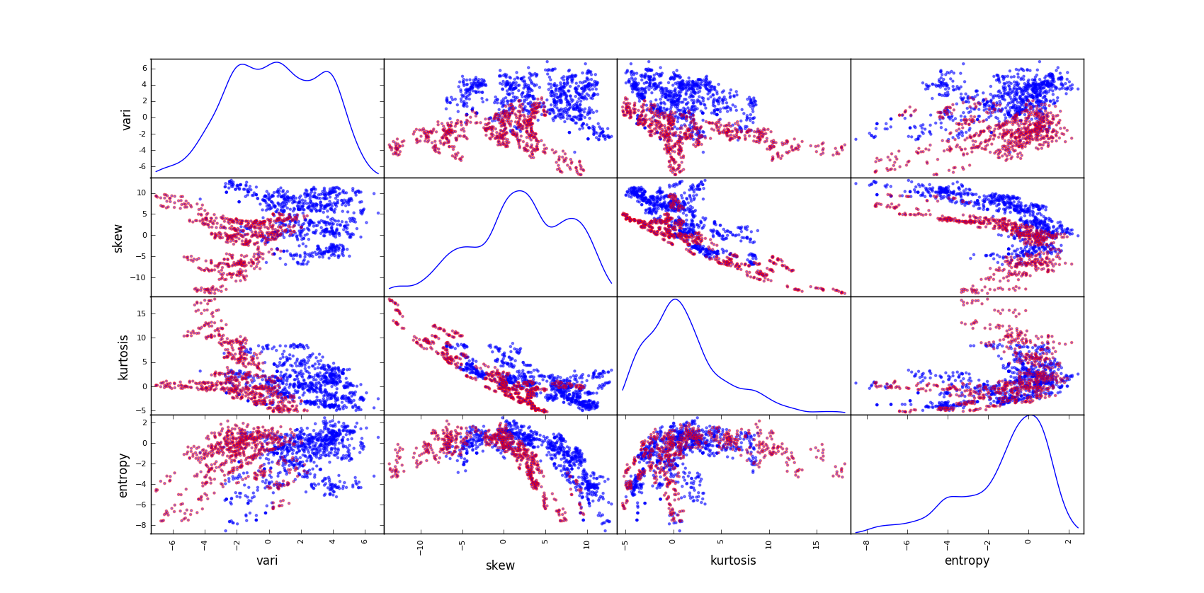
A scatter plot is the most straight-forward way to understand intuitive and obvious patterns in the data. It is especially efficient when the number of variables and classes is limited, such as our data set. It allows us to understand class-dependent, non-linear relationships between variables.
This is much more efficient than a simple statistic, such as the correlation coefficient which would not have found the skewness and entropy to be related. From these rather strong relationships between variables, we now know that some techniques based on independent features might not be efficient here.
Testing a distribution with Quantile-Quantile plots
# Subsetting the data by class
d0 = data0[data0["class"]==0]
d1 = data0[data0["class"]==1]

# For each variable
for v in data0.columns[:4]:
#set the figure size
plt.figure(figsize=(9,4))
# define two subplots
ax1 =  plt.subplot(121)
# compute the quantile-quantile plot with normal distribution
stats.probplot(d0[v],dist='norm',plot=plt)
# add title
plt.title("Normal QQ-plot "+v + " - Class 0")
ax2 = plt.subplot(122)
stats.probplot(d1[v],dist='norm',plot=plt)
plt.title("Normal QQ-plot "+v + " - Class 1")
plt.savefig("qqplot_"+v+".png",width=700,height=250)
plt.show()
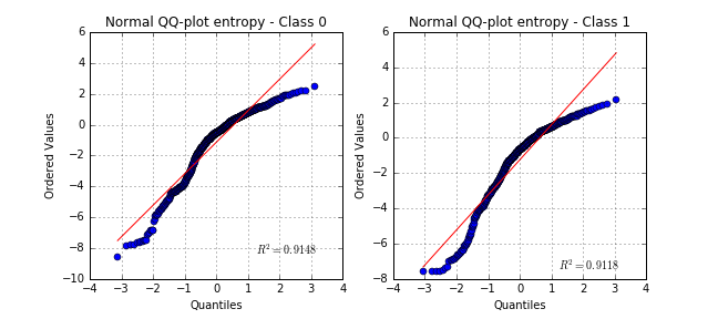
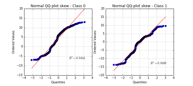
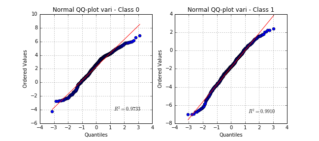
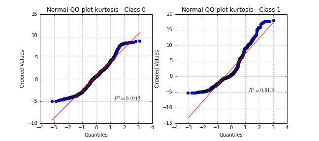
Even though some variables are quite far from normally distributed, the hypothesis would be acceptable for some model-based learning algorithms using properties of Gaussian variables.
Non-parametric distribution with boxplots
Boxplots represent the data using 25th, 50th and 75th percentiles which can be more robust than mean and variance. The pandas library offers a quick method and plotting tool to represent boxplots for each class and variable. It highlights the differences in the spread of the data.
data0.groupby("class").boxplot(figsize=(9,5))

This will be useful in the next part, when the data will be transformed to enhance the performance and robustness of predictive models.
So see you in the next part for feature engineering!
Mathieu Besançon
Researcher in mathematical optimization
Mathematical optimization, scientific programming and related.